
Jet2holidays & Jet2.comLive flight status
Delivering real-time live flight information to users on their day of travel.

Project overview
Background
During disruptions, Customer Operations will notify customers via SMS, email, or push notifications, directing them to the live flight page.
The page sees high traffic, with 71% of users coming from web and 22% from the app.
Goal
The main focus of this project was to improve the overall app experience by making the flight status visible on the booking without the need for a customer to search for it on this page, enhancing the user experience on the customers travel day.
The web design was also looked at as part of this project so that it was in line with the UI used on the app.
Problem statement
The current process on the app is disjointed, requiring the user to enter their flight details to view this information.
The experience is time consuming and too many clicks for the user which creates a negative experience when they must keep re-entering details to view this information, ultimately impacting our overall NPS rating.
After re-entering booking details, the page currently shows information for all flights in that criteria, not just that customers specific flight – for example, if you were to enter Manchester to Tenerife all flights within the next 72hours would show making it harder for the user to find their flight.
Research
Previous experience - App
Users can access this page from the saved booking or flight page on travel day, as well as other touchpoints like the homepage or side menu.
Selecting “Check flight status” prompts users to enter details to view the latest flight information.
The “More info” option shows messages related to flight status, airport updates.


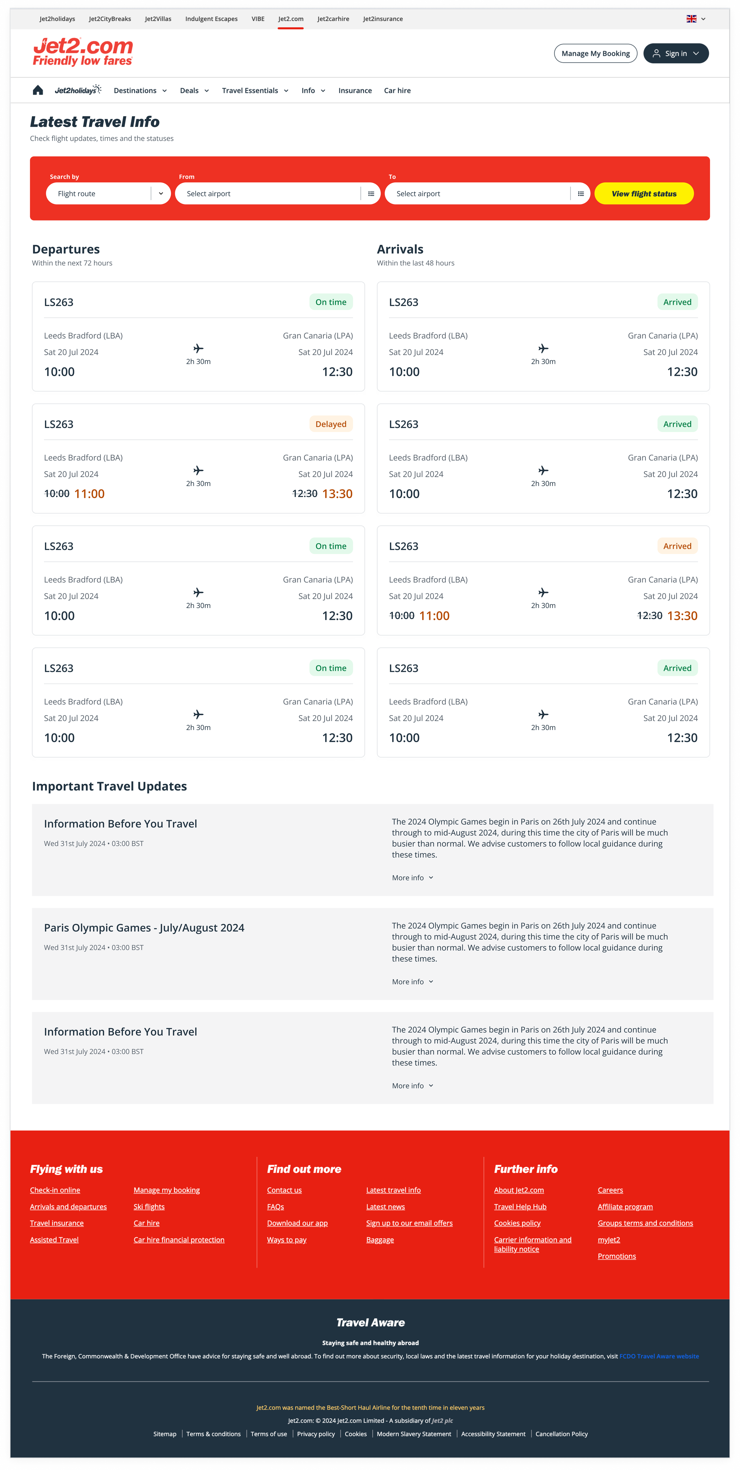
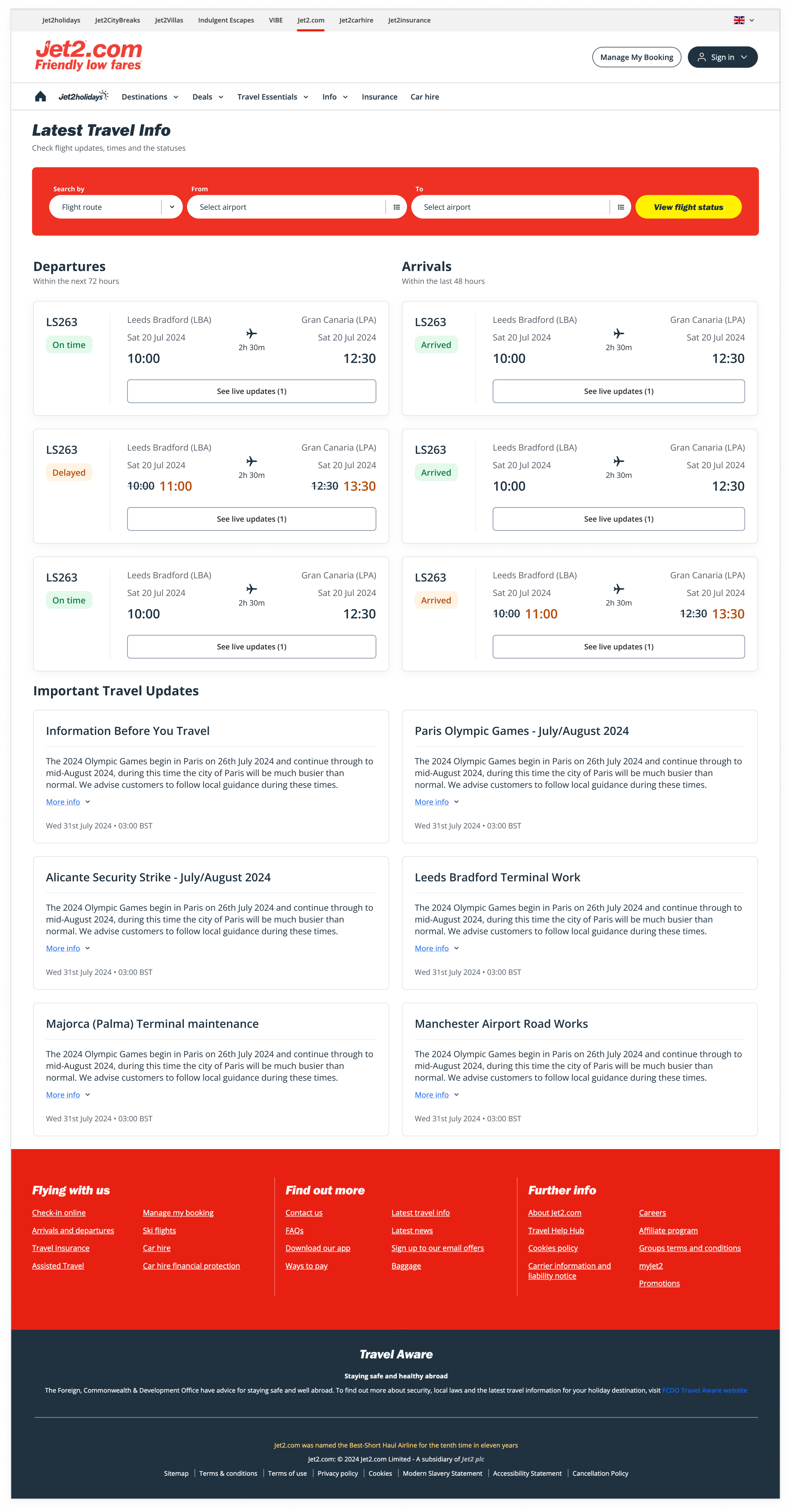
Previous experience - Web
The web page can be accessed by anyone no booking required. It displays general messages (e.g., key events, airport maintenance) visible to all users.

Flights are listed individually; if a flight is diverted, it appears again as a new entry, which may confuse users.
Data & insights
Quantum data (app + web)
89.5k visitors to the live flights web page (past 30 days).
153.3k sessions on the live flights web page (past 30 days).
28.7 seconds of average engaged time.
User behaviour
Most app users access the page through the flights tab on the booked state.
Users visit the page several times on day of travel, so repeatedly entering booking details is inefficient.
Users that opt to add the flight route as a way to search get multiple flights for the same route back so then have to further scroll to find their exact flight.


App designs


Since the flight component already existed, the focus was on how best to display status updates and related messages.
Initial designs placed messages directly in the component, but as they were often lengthy, alternative concepts were explored.
Concept 1
This option lets users expand “More info” to view flight messages, keeping the screen focused on flight times. The drawback is that messages may be longer than the examples tested.


Concept 2
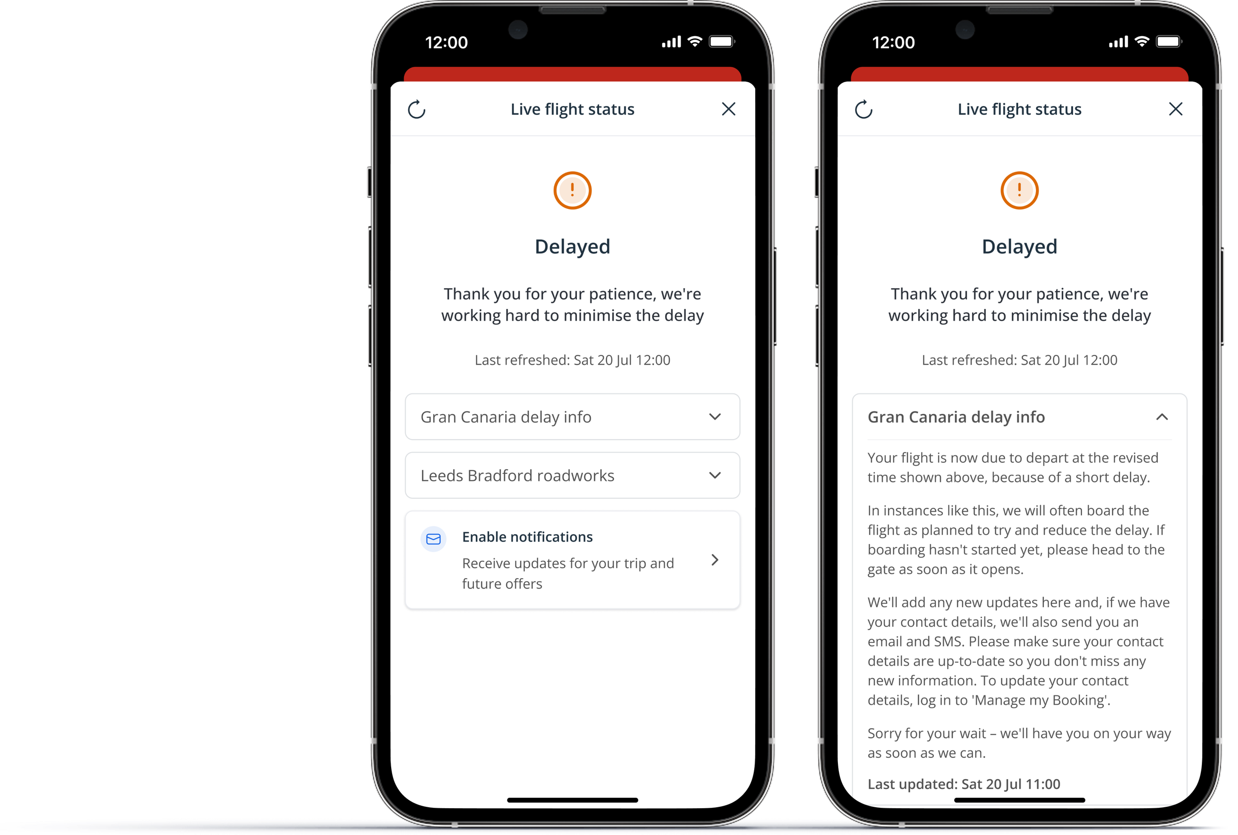
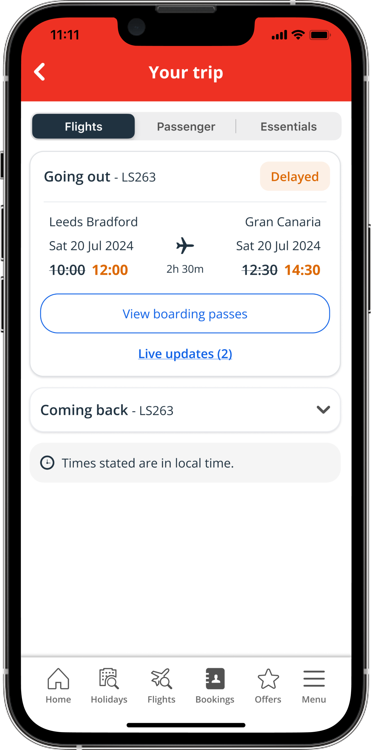
This option keeps the “More info” CTA but opens a bottom sheet with flight updates. It accommodates longer text and is more noticeable, but multiple messages (e.g. roadworks plus a flight delay) may need to be shown together in the modal.


Testing
Key findings
Users are easily accessing additional flight updates via “More info” CTA on both designs.
However, many users are clicking the status label expecting it to take them to more information.
Users find version 2 easier to digest as the information is displayed separate to everything else on the page.
Various users found that version 1 is not as easy to read as there’s a lot of key information displayed within one section.
Next steps
Develop version 2 so that multiple messages can be displayed on the screen.
Make both the label and the CTA clickable or make the label look less clickable.
Finalise possible status’ and map out which scenario these will be used for.
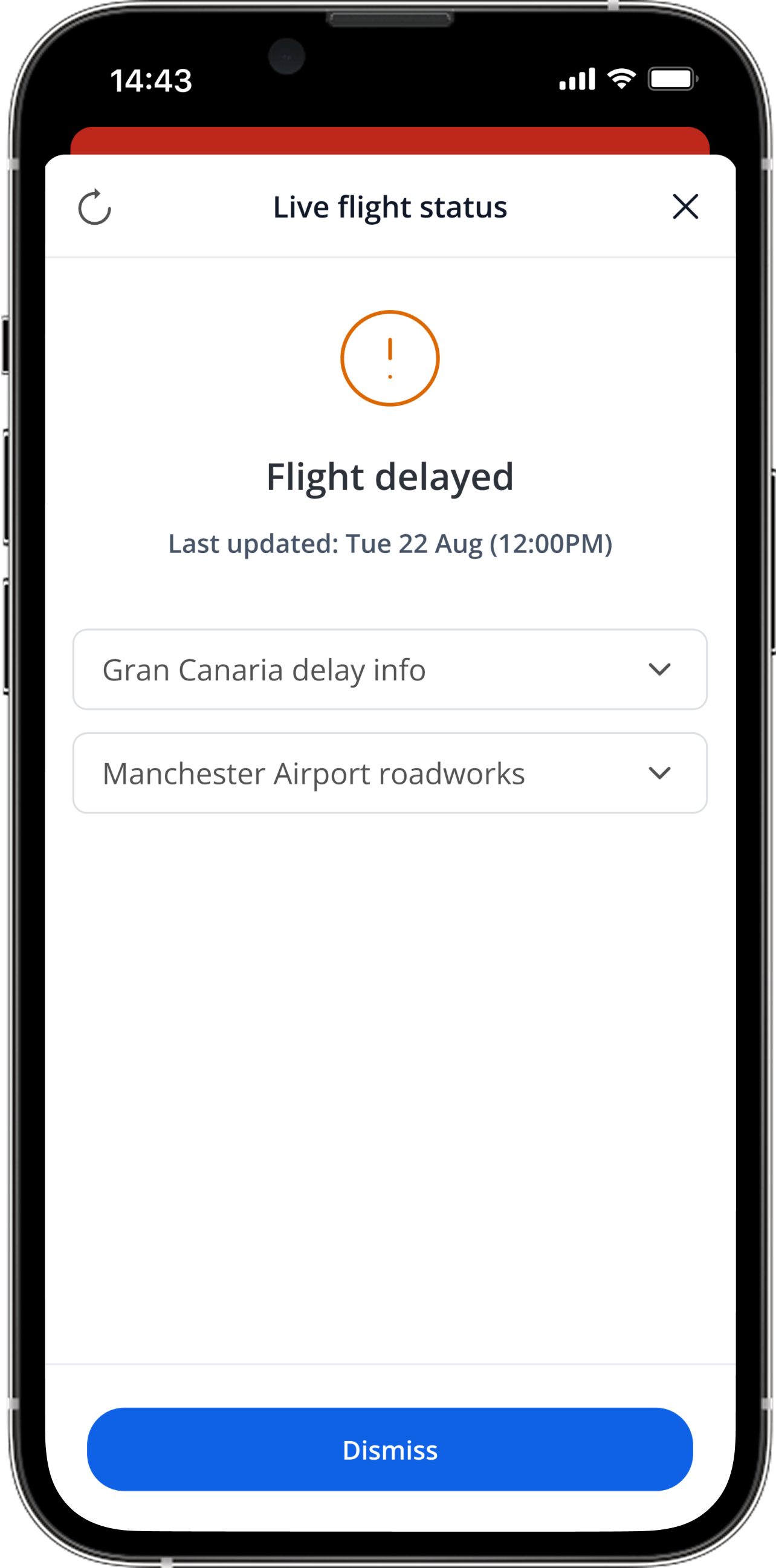
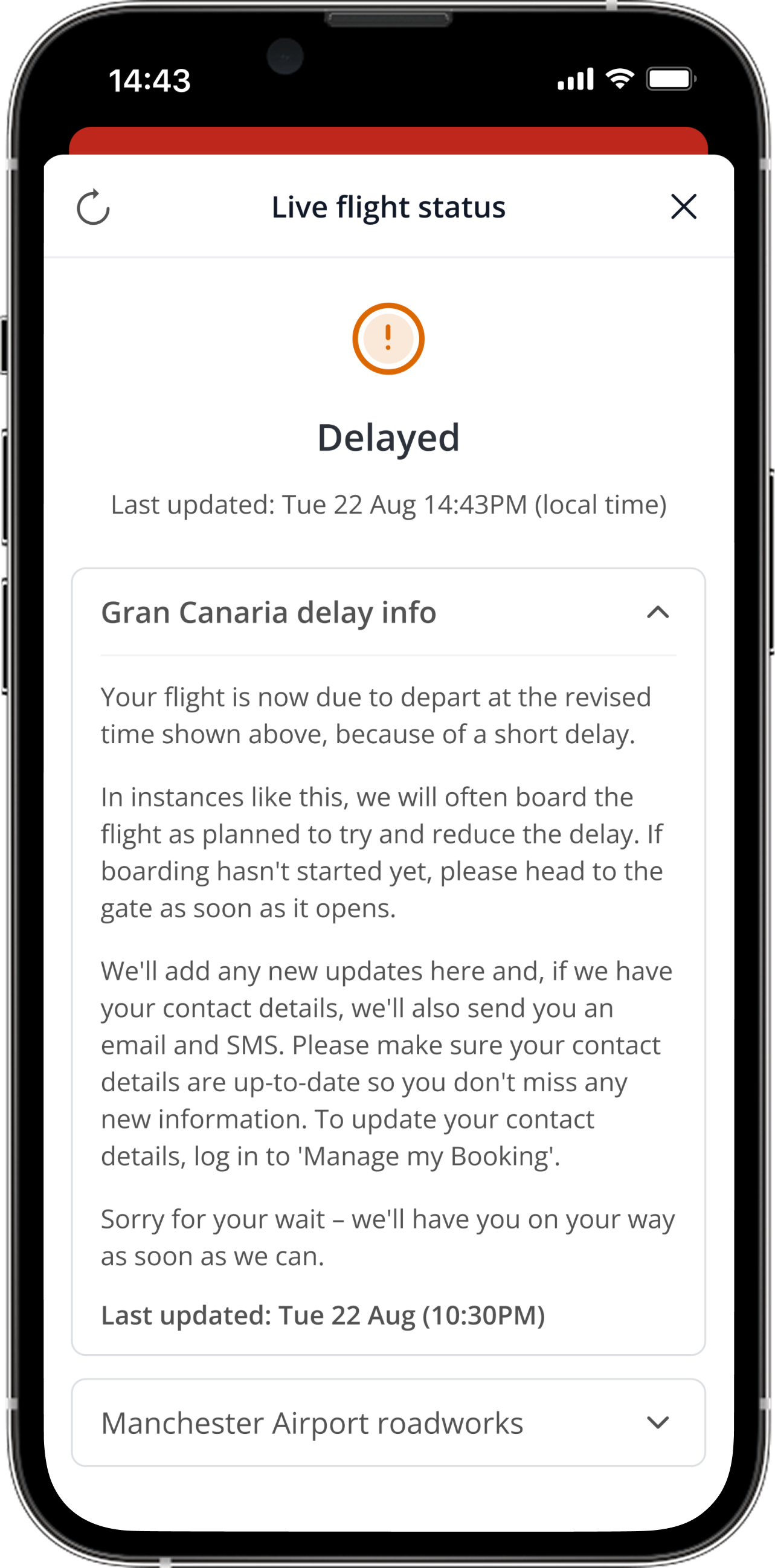
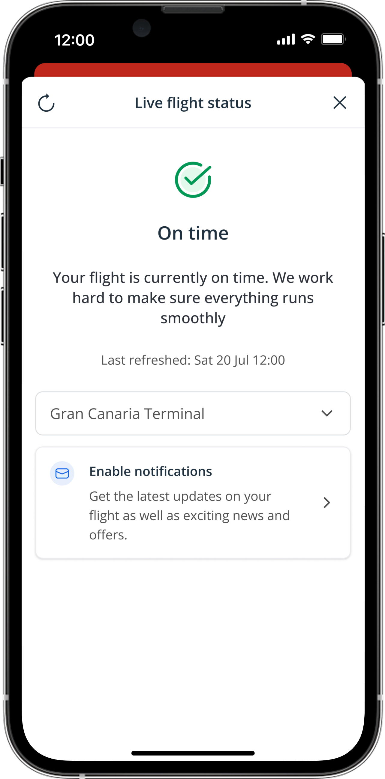
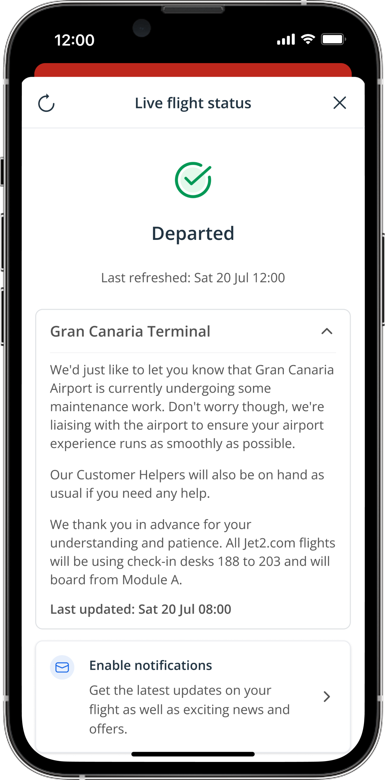
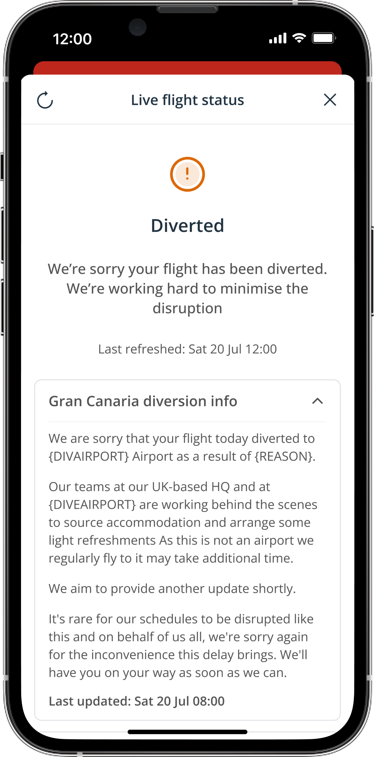
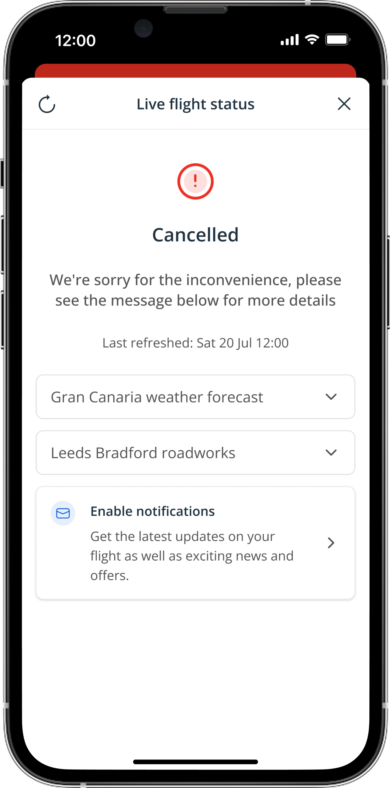
A full-page modal allows multiple messages to be displayed, with last updated shown for both status and messages. Users not opted into push notifications will see a prompt.


Web concepts


Status mapping
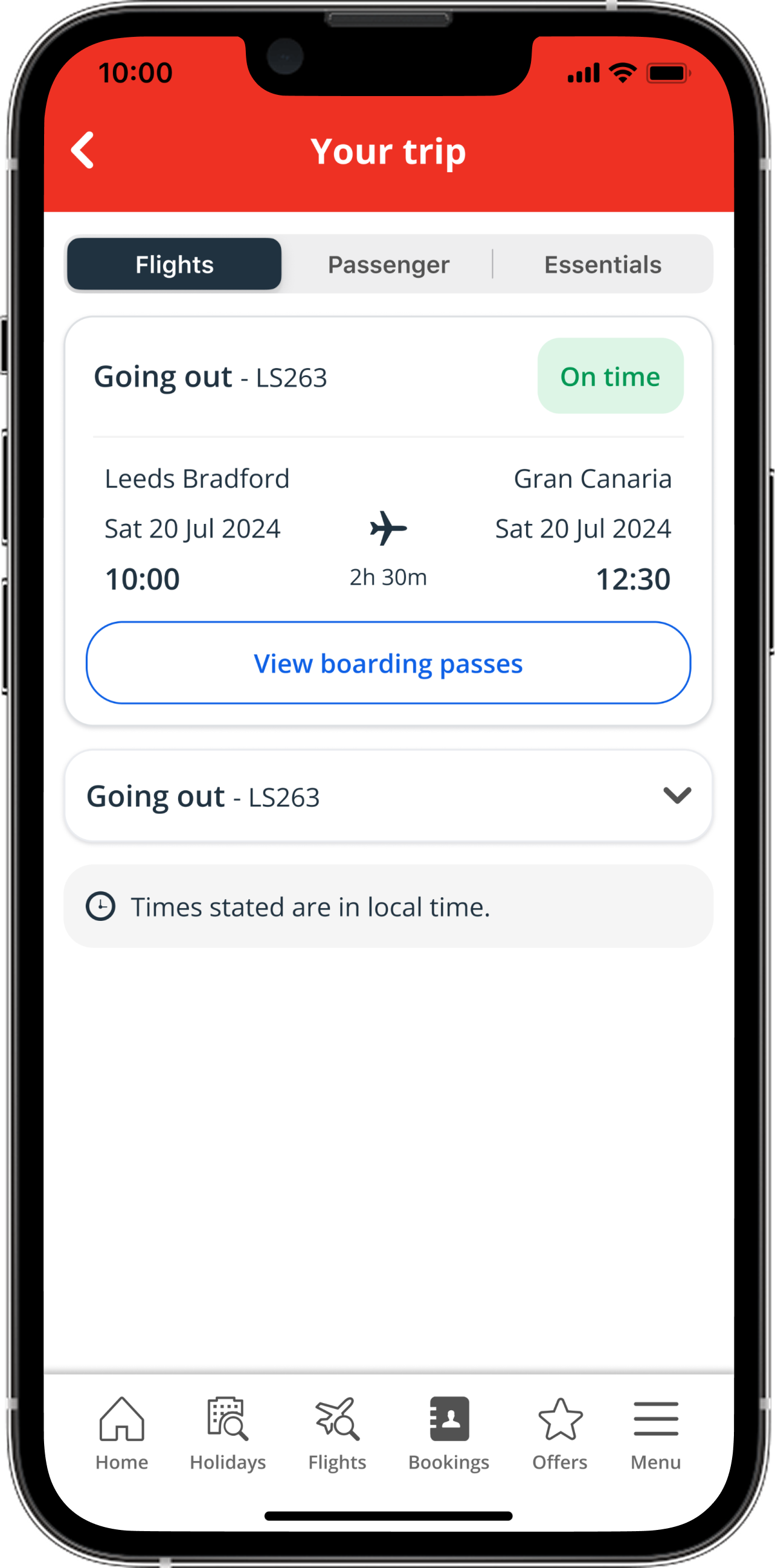
On time
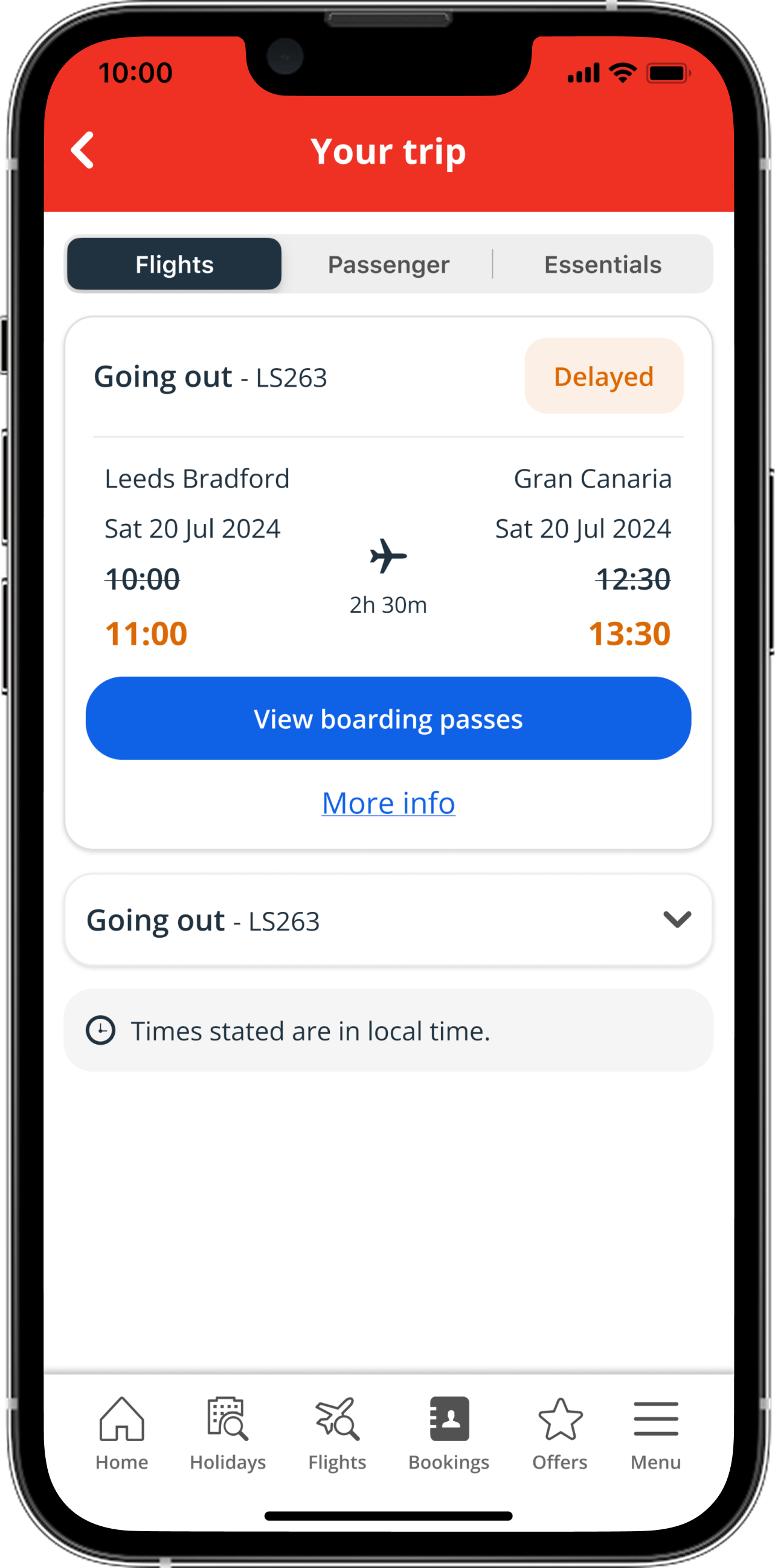
The on time status will be used to show customers that their flight should depart and arrive according to its scheduled times. The app will start calling the API 2 hours before departure.
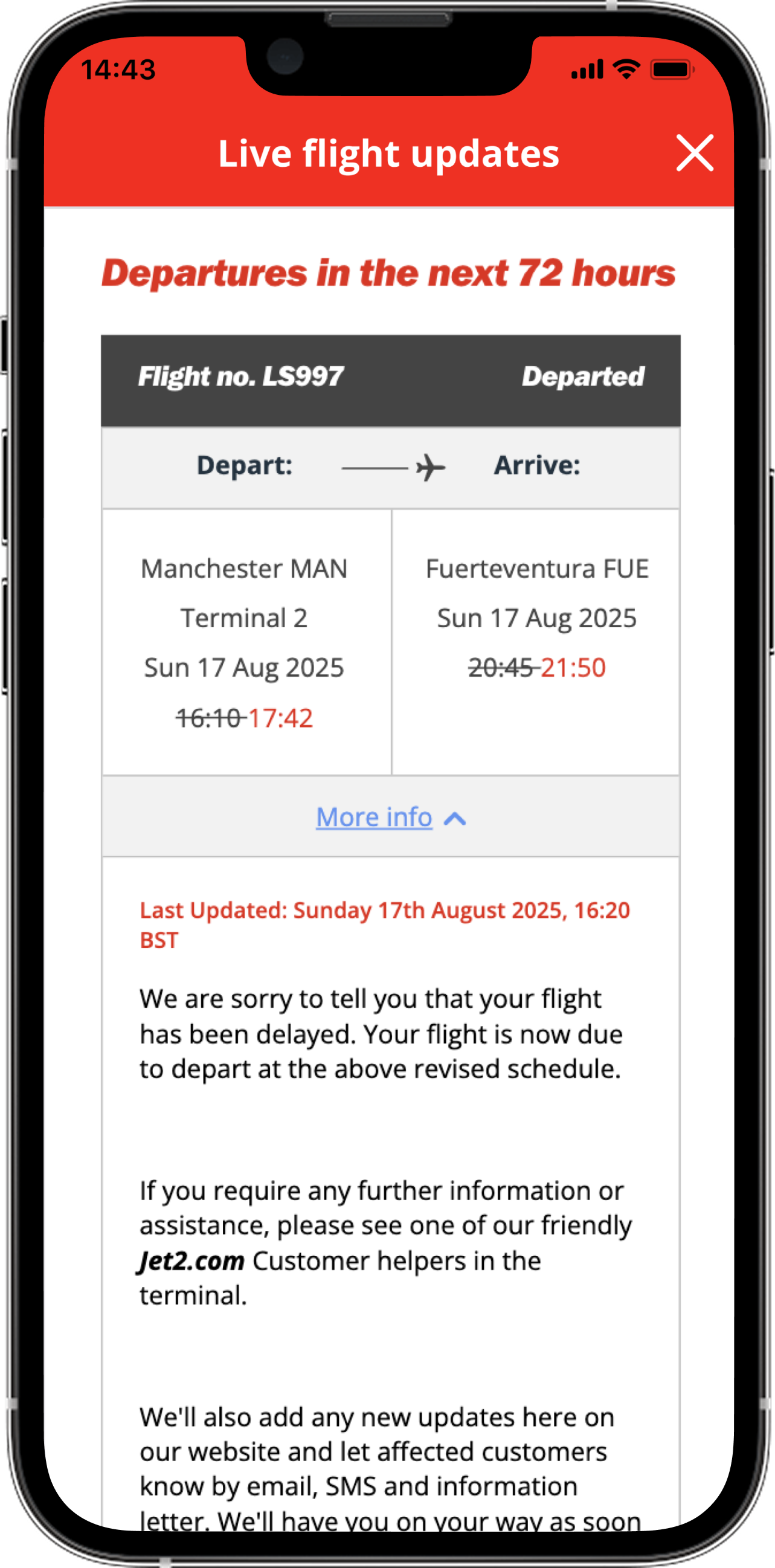
Departed
Departed status is for any flights that have successfully taken off from the airport, the actual departure time will be shown alongside the expected time if the flight took off earlier or later than scheduled.
Delayed
Flight departs or arrives later than its scheduled time, depending on how long the delay is a message may be added to the modal to explain the reason for the distruption.
Diverted
Flight has rerouted to land at a different airport than originally scheduled, usually due to weather, technical issues, or emergencies.
Next info TBC
The following status will be used when additional time is needed to manage a flight due to an unexpected event or issue.
Next info HH:MM
This status is similar to the previous "next info," but it specifies the exact time when more information will be available to the user.
Arrived
The aircraft has landed at its destination airport. In some cases, the actual arrival time will be shown alongside the expected time if the flight arrived earlier or later than scheduled.
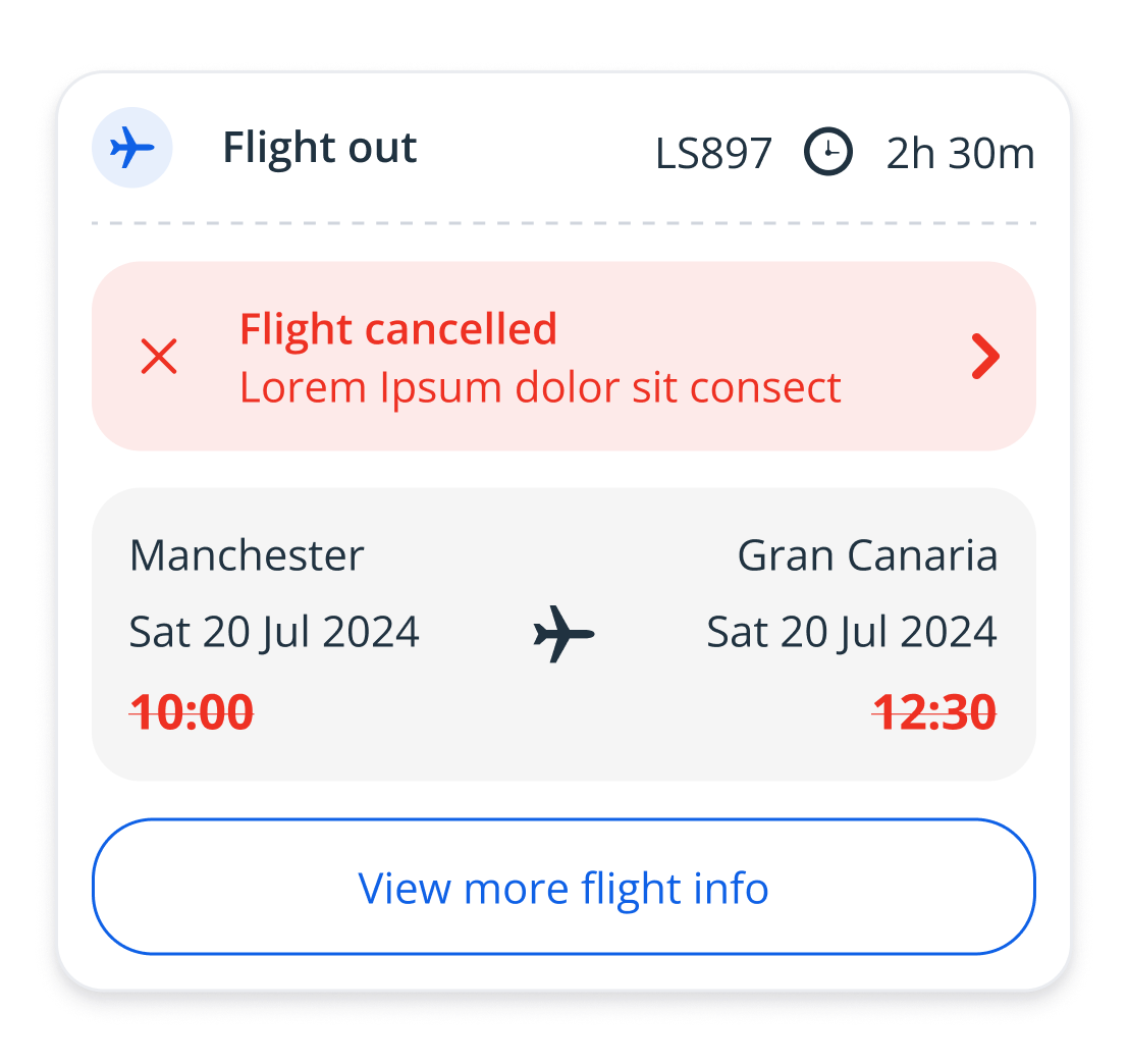
Cancelled
Flight will no longer go ahead as planned, message will update in the app to explain the reasoning for this and next steps for the customer to take.
Final design


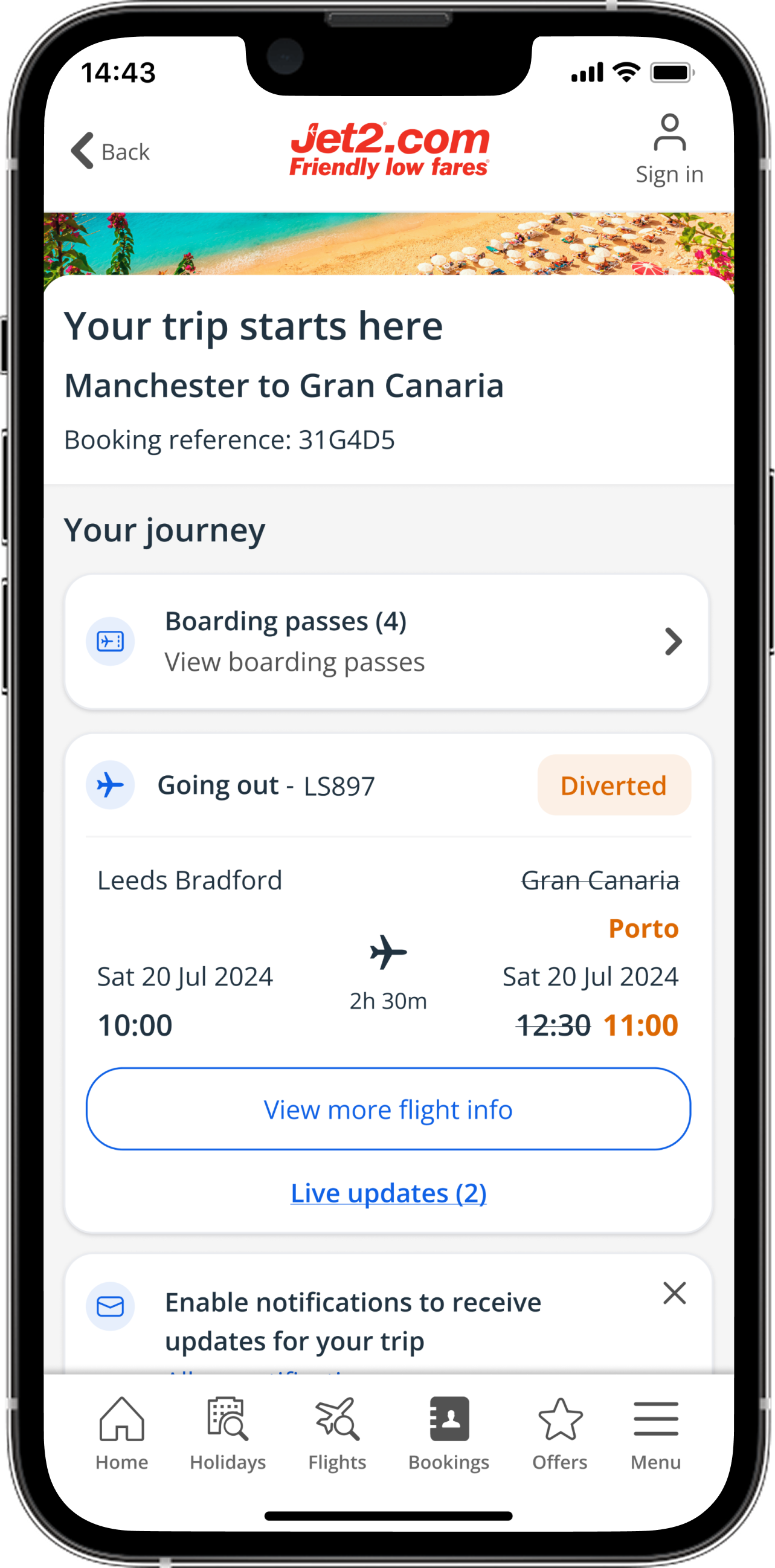

Mobile app

Tablet


Web

Jet2holidays & Jet2.comBooked state

Redesigning the app homepage using more inspirational content and personalisation

Inspirational homepage
Jet2holidays & Jet2.comRedesigning the app homepage using more inspirational content and personalisation