

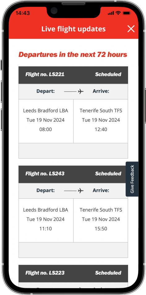
Live flight status
Delivering real-time live flight information to users with a saved booking in the app on their day of travel.
Jet2holidays & Jet2.com
Project overview
Background
During disruptions, Customer Operations will notify customers via SMS, email, or push notifications, directing them to the live flight page. If the app is installed, it will open the page in the app; otherwise, users can access it via a web view.
The page sees high traffic, with 71% of users coming from mobile web and 22% from the app.
Goal
Display real-time flight status directly on the flights page within the booking in the app, enhancing the user experience on the customer’s travel day.
Problem statement
The current process is disjointed, requiring customer to re-enter flight details to view information. This negatively impact the customer experience and are overall NPS rating.
After re-entering booking details, the page shows information for all flights within that criteria, not just the customer’s specific flight. This can be confusing, as users may misinterpret the information. It also makes the page cluttered, leaving users unsure which details to rely on.
We are currently unable to feed delay information (more specifically the override information) into the app for instant, up to date information.
The process is also a lot of clicks for the user to find the information they require.
Research
Previous experience
User currently has to click on the ‘Check flight status’ CTA to open the web page within the app. ‘See more’ allows users to view any messages that relate to the flight. This may be status information or Airport / traffic details.


Data & insights
Quantum data
89.5k visitors to the live flights web page (past 30 days).
153.3k sessions on the live flights web page (past 30 days).
28.7 seconds of average engaged time.
User behaviour
Users access the page via the main booked state page on days of travel, the flights tab, live flight updates in handy links or side menu.
Users visit the page several times on day of travel, so repeatedly entering booking details is inefficient.
Users that opt to add the flight route as a way to search get multiple flights for the same route back so then have to further scroll to find their exact flight.

Ideation
The homepage highlights key CTAs—"Search Holidays," "Search Flights," and "Manage Booking"—with a clean design. Holiday videos take center stage, personalized based on user history. The layout allows for smooth scrolling or swiping to reveal more content.


Version 1
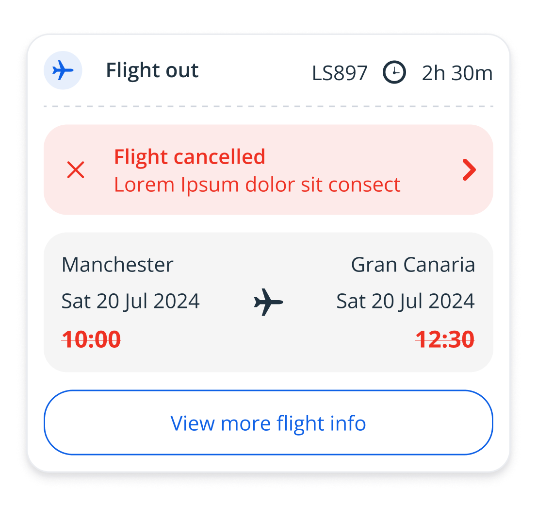
This option provides the ability to expand the ‘More info’ section to reveal and messages associated to the flight. It also creates a less busy screen which allows the user to focus mainly on the flight times. The only issue may be that the messaging could be much longer than the example used and take up the full screen.


Version 2
This option still uses the ‘More info’ CTA however, on click opens a bottom sheet providing any relevant flight updates. Although this option allows for more text and stands out more to the user, the general length of these messages can be a lot greater and sometimes you see more than one message associated to each flight for example, there may be roadworks at Leeds Bradford and there also may be a delay to the flight - both of which would need to be presented in this modal.


Testing
Key findings
Users are easily accessing additional flight updates via “More info” CTA on both designs.
However, many users are clicking the status label expecting it to take them to more information.
Users find version 2 easier to digest as the information is displayed separate to everything else on the page.
Various users found that version 1 is not as easy to read as there’s a lot of key information displayed within one section.
Next steps
Develop version 2 so that multiple messages can be displayed on the screen is needed.
Make both the label and the CTA clickable or make the label look less clickable.
Finalise different possible status’ and map out which scenario these will be used for.
Final design


Tablet
For tablet the live flight updates messages are displayed in a modal.