
Jet2holidays & Jet2.comInspirational homepage

Redesigning the app homepage using more inspirational content and personalisation

Project overview
Background
The previous homepage was designed a few years ago when the Jet2.com and Jet2holidays apps were merged. The primary goal of this homepage was to ensure both brands were prominently featured while providing a simple and straightforward path for users to access the booking process.
Goal
Create a more engaging app homepage that highlights destination content and motivates users to book a holiday. Enhance personalization across the content and simplify the layout to ensure it’s clear and easy to navigate.
Problem statement
The app's homepage is missing inspirational content, which could engage users more effectively. Additionally, it contains a lot of information, making it overwhelming at first glance. Users may struggle to determine where to navigate first, which can hinder their experience.
The design feels somewhat outdated and could benefit from a refresh to align better with the app's other native screens. Furthermore, there is minimal personalization; while the app adapts based on a user's booking or recently viewed holidays, there is potential to enhance this feature for a more tailored experience.
Research
Homepage interaction report
The 3 most interacted touch-points on the current app homepage:
Bottom Nav
Top section (search holidays, search flights, MMB)
Saved bookings carousel
Homepage interaction report
Questions:
How would you describe the current app homepage in 3 words?
Easy, good, simple, cluttered, fun, informative.
If you could change anything about this homepage what would it be?
Less busy, nothing, more clarity, clearer design

Option 1
The homepage highlights key CTAs—"Search Holidays," "Search Flights," and "Manage Booking"—with a clean design. Holiday videos take center stage, personalized based on user history. The layout allows for smooth scrolling or swiping to reveal more content.


Option 2
The homepage would use a promo banner layout to showcase current offers, allowing users to swipe through multiple deals with pagination dots. To minimize distractions, minimal video content would play in the background, or an image may be used for better accessibility.


Testing
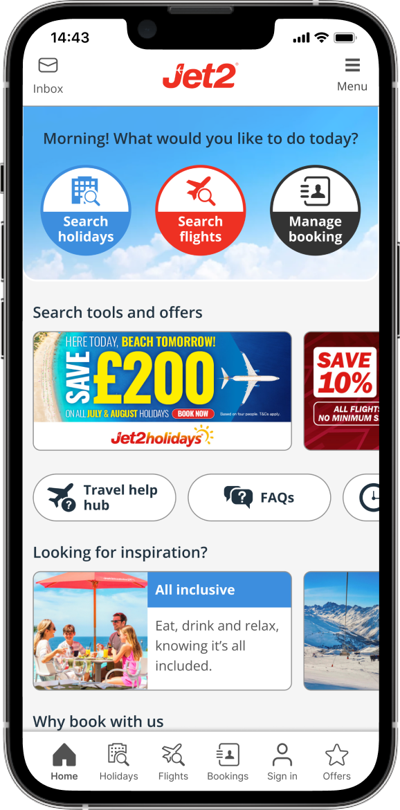
Current homepage
Key observations:The currently homepage performs well overall however, the amount of content on the page made it harder for users to find what they were looking for.
10/14 (71%) users found flights search.
12/14 users (86%) found holidays search.
10/14 users (71%) were able to access a booking.
12/14 users (86%) were able to find offers.
3 words to describe: Easy, good, simple, cluttered, fun, informative.
Option 1
Key observations:Users appreciated the inspirational content and simplified layout, which made key touchpoints easier to find. However, not everyone noticed the 'scroll to explore' feature, so more accessible options are needed.
13/14 (93%) users found flights search.
14/14 users (100%) found holidays search.
13/14 users (93%) were able to access a booking.
12/14 users (86%) were able to find offers.
3 words to describe: Professional, straight forward, modern, fun.
Option 2
Key observations:Most users liked the combination of inspirational content and offers, but some felt it was too sales-driven and took up too much screen space. Many also tapped on the offer expecting it to lead somewhere.
13/14 (93%) users found flights search.
13/14 users (93%) found holidays search.
12/14 users (93%) were able to access a booking.
9/14 users (64%) were able to find offers.
3 words to describe: Eye catching, promotional, inspirational, sales.
Final design
The concept will be A/B tested against the control to see if a simpler design with more inspirational content boosts conversion rates. The bottom content will be revised but kept the same as the control for a fair test.
By shortening the image the rest of the homepage content is not visible on the screen, making users more aware that the page scrolls. This sections also allows for offers to be seen in the default state, recently viewed and then saved booking to be visible for easy access.


Outcomes
A/B test
The homepage A/B test launched in August 2024, and ran for 7 weeks and reached 91% statistical significance. While this falls slightly below the usual 95% threshold, it is still a noteworthy result and was consistent throughout. Additionally, it recorded the highest homepage click-through rates at an overall view, particularly for the "Search Holidays" CTA and the offers tab.
The homepage was pushed to 100% on both iOS and Android on X and now mention any analytics data you can find…
User booking conversion rate is highest on variant B @+1.6% comparing to control, reaching 91% statistical significance.
Variant B stood out, achieving the highest click-through rate on the offers tab, outperforming the control by +4.58%.
For the recently viewed cards, the control outperformed the variants in click-through rates. However, when analysing the percentage of bookings from recent search click-throughs, Variant 2 led with a +6.42% increase compared to the control.
The inbox tab achieved the highest click-through rate in Variant 2, outperforming the control by +5.32%.