
Jet2holidays & Jet2.comBooked state redesign

Redesigning all of the booked states within the app to enhance the user journey throughout every stage of the booking

Project overview
Background
The previous Jet2 booked states were created over four years ago, at a time when the app had limited native functionality. As a result, the design was simple and functional for its purpose.
However, with ongoing improvements to the app over the years, it now has the capability to present more detailed information, offering a more personalised customer experience.
Goal
Display on the booked states the most relevant information at each stage of the journey.
Problem statement
With the app now being more advanced, the previous design tile structure no longer accommodates the increased amount of information and limits what can be displayed on the booked state. Some of the following constraints were also identified:
Limited opportunities to personalise the post-booking pages and deliver a truly customer-centric experience.
Lack of inspirational content about the booking destination that can help app users plan their time away.
Design is inconsistent across all states and brands, and the UI appears outdated, requiring a refresh.
Research
Previous design
The app is currently organized into different states (Pre-travel, Day of Travel, In Resort, Journey Home, and Welcome Home) to provide the most relevant information at each stage of the journey. However, there isn't much variation between these states at the moment.
Customers have responded well to the current design they particularly like the exisitng countdown and feel like gets them excited of their holiday.
The counters used although not in the right context give the user some kind of indication as to how many seats they have added for example.
The primary ‘Manage this booking’ CTA currently takes the user to a web version of MMB, this has similar features and can sometimes confuse the user as its essentially another version of the same page.


Workshop
The workshop included three tasks. First, we analysed the existing saved booking app screens for Jet2holidays and Jet2.com, noting what we liked and disliked. Next, we reviewed competitors like EasyJet, TUI, British Airways, and Virgin, identifying useful features and areas to avoid. Finally, we mapped out user needs at different stages of the journey to ensure we deliver them at the right time.
Overall takeaways:
Use inspirational destination imagery
Have a flight / holiday summary at top of the page
Make flight times more visible on day of travel
Some kind of timeline / itinerary to guide the user throughout the day of travel airport experience
Live flight information such as gate number / flight number / terminal / delays or flight updates
Things to do whilst in resort
Passenger information easily accessible

User needs
To provide the best user experience, understanding user needs for each state was key to setting the correct priority order.
In the initial workshop, sticky notes were used to identify these needs, and further user testing helped pinpoint what’s most important before, during, and after a holiday.
Analyzing data from existing designs also helped identify user behavior and priorities.

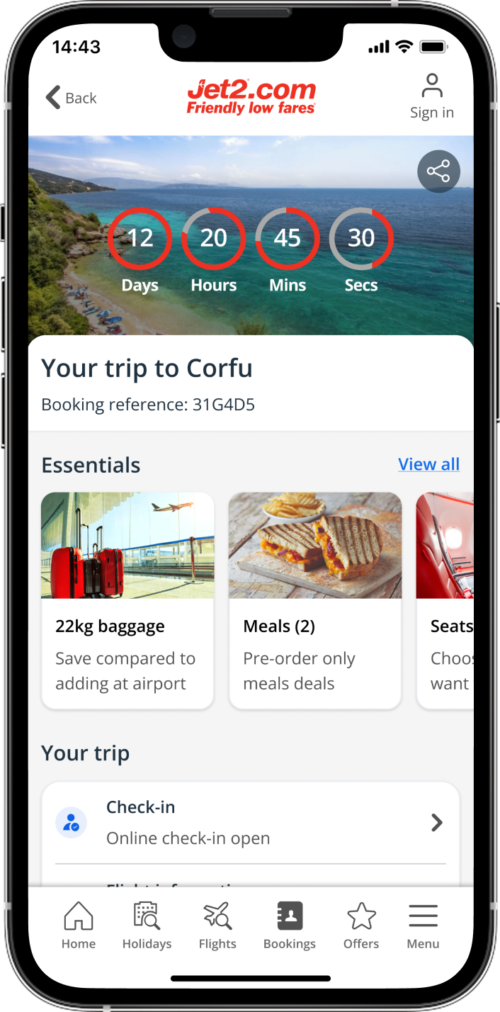
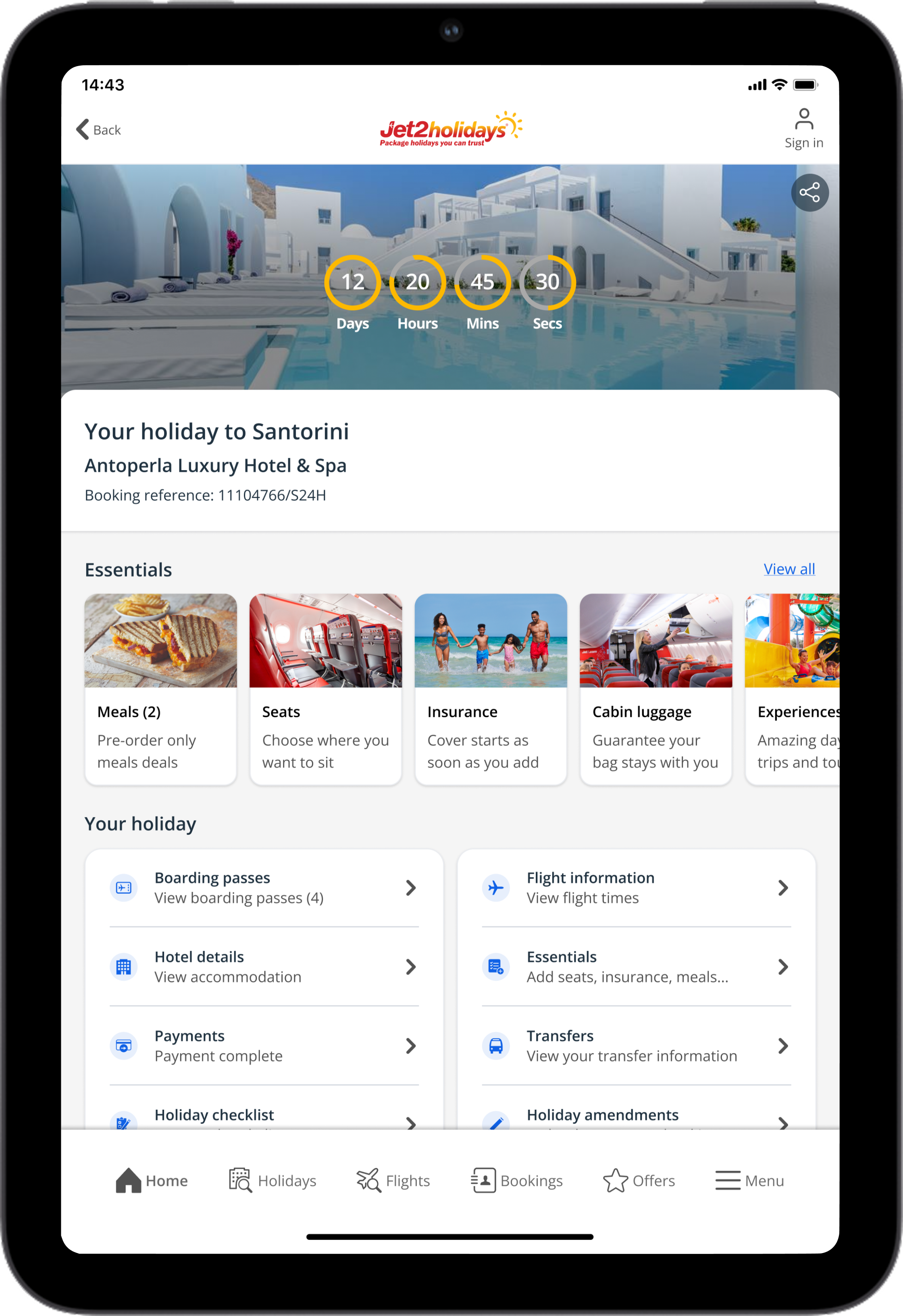
Pre-travel
AmendmentsMany users seek to make changes to their bookings within the first few weeks.
Add-onsAn opportunity for the business to upsell items like seats, meals, and bags.
PaymentsImproved visibility of payments / upcoming due dates.
Key findings
Day of travel
Boarding Passes The most frequently clicked feature on the day of travel.
Flight Information Access to flight details, including gate and status, was seen as important.
TransfersEspecially important on the journey home for hotel pickups.
In resort
SupportUsers want easy access to contact details for in-resort reps or customer support.
Things to Do
Users would appreciate this feature to help plan activities and potentially promote excursions.
Hotel InformationUsers seek more detailed info on hotel facilities.
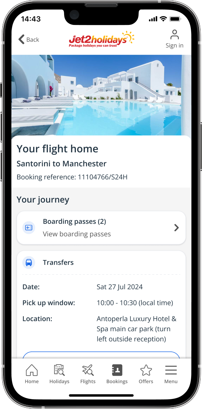
Journey home
TransfersDate & time of transfers pickup back to the airport. Ability to track this would also be useful.
Boarding PassesEasy access, especially when at the airport and through security.
Flight informationChecking flight information and flight status.
Welcome home
FeedbackAllow users to share input for us to then gain knowledge to make improvements.
Next Trip SuggestionsPersonalise suggestions based on past bookings and previous user behaviour.
OffersPromote rebooking with post-booking discounts.
Initial designs
Iteration 1
My initial idea was to divide the page into three tabs. The Itinerary tab would feature a timeline layout, giving users access to flights, transfers, and additional details. The Manage Trip tab would include all the self-service amendment options that users previously accessed through 'Manage My Booking.' There would also be separate tabs for add-ons like seats, bags, meals, etc.


Use-ability testing
Navigation test | 15 participants:Users were asked to find touch-points like adding meals or special assistance using a working prototype, with success metrics tracked. Their screens and microphones were recorded to better understand any struggles and their overall perception of the design.
Key findings
Most users completed the task successfully, but the 'Itinerary/Manage Trip/Essentials' tab was often overlooked, causing delays and sometimes leading to task abandonment.
Displaying flight times on the 'Itinerary' screen received positive feedback, along with other updates showing key day-of-travel details like bag drop, security, and gate information.
Users appreciated having transfer details on the journey home flight page, as it helps alleviate concerns about the pickup for the return trip.
Overall, the content was useful to users, but the navigation to some self-serve and ancillary features was lacking.
Iteration 2
This menu-style layout organizes information by priority, ensuring users see everything on the first screen, reducing the chance of missing items. As departure approaches, the priority shifts to show more relevant details, while previous amendments remain accessible on a separate page.


Use-ability testing
Navigation test | 15 participants:Users were asked to find touch-points like adding meals or special assistance using a working prototype, with success metrics tracked. Their screens and microphones were recorded to better understand any struggles and their overall perception of the design.
Key findings
This test performed better than the last with a 90% success rate.
Users preferred the list-style structure and found it easy to navigate to different areas of the app during the tasks set.
They also appreciated the sub copy on the list items, as it clarified what they were navigating to.
More users were able to locate the amendment journeys, which is an overall key business objective that needed to be considered within these designs.
Final designs
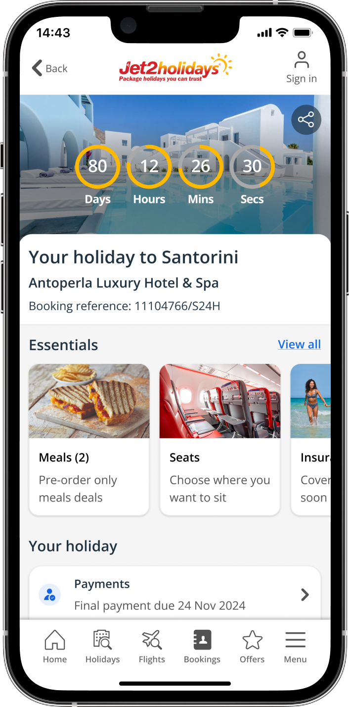
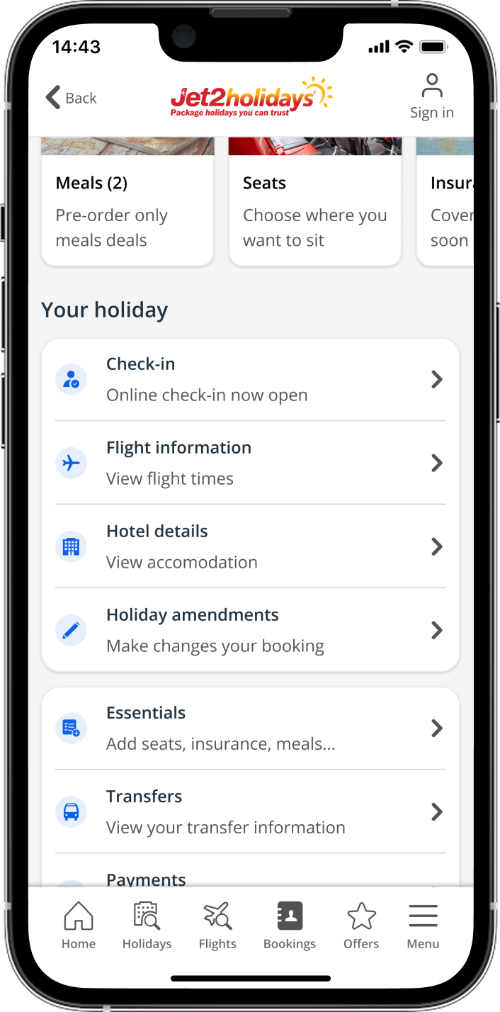
Pre-travel
The saved booking screen shown for pre-travel, will remain visible until the day before departure, focusing on outstanding payments and booking amendments when more than 28 days remain.
The holiday amendments page was also added to let users modify their bookings, promoting visibility of options and encouraging self-service over contacting the call centre.
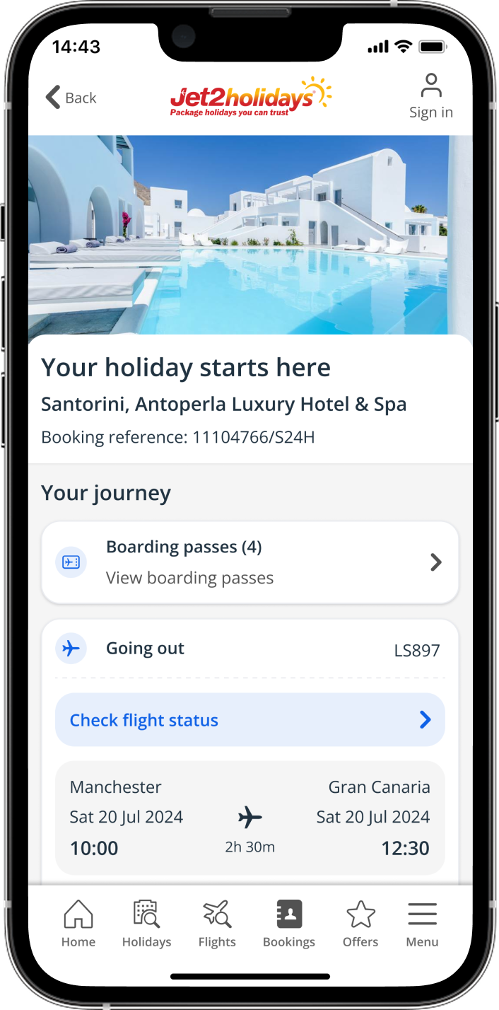
Day of travel
On the day of travel, this screen provides users with easy access to boarding passes and key flight details.
Outbound flight details are expanded for easy access to flight status, with quick links to the Je2shop magazine and in-flight menu.
If a user misses online check-in, they can still check in at the airport, and the app touchpoint will update accordingly.

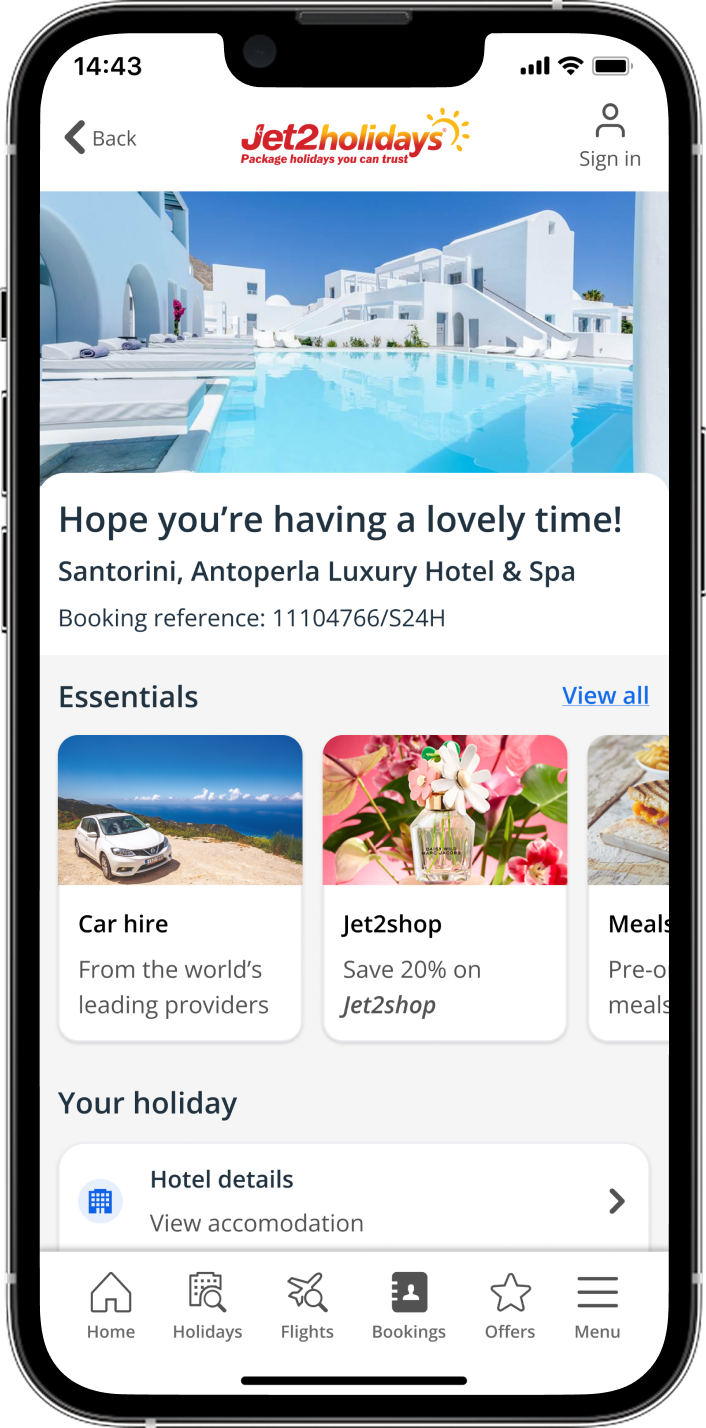
In resort
During the holiday, the content is focused on the hotel and resort, offering a helpful guide with welcome information for use as needed.
Improved access to the 24/7 helpline and resort FAQs, with a travel inspiration carousel inspiring users to explore the resort further.
Each card links to a blog post where users can learn more about local restaurants, activities, beaches, and points of interest.

Journey home
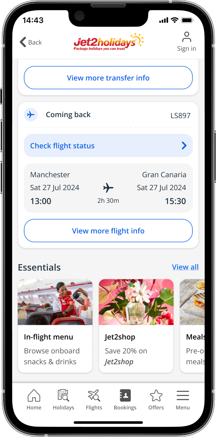
The journey home state gives the user all the details for their flight home with easy access to boarding passes, similar to day of travel.
Transfer details are also pulled out into the main page to give the user better visibility of their transfer slot and pick up location.
The flights component is also expanded to give quicker visibility of flight times and flight status.
Welcome home
After the holiday, the booked state updates to let users easily rebook the same trip or plan a new one.
It provides offers for the next booking and an option to give feedback on the holiday experience.


Other brands


Tablet

Outcomes
Feedback
The newly designed booked state was launched in August 2024, and since then, we've received amazing feedback, including a noticeable increase in positive reviews on the App Store:
"“It’s great to search, book and find all the details for your holiday in one place. Easy to use and very convenient”
“Love this app, I can check my holiday, make a payment, see what I have to pay and final payment date. I can change things about my holiday if I need to, it’s easy to use. I’ve done all my bookings with the app what more could I ask for”
Data
We’ve tracked an impressive 72% of holiday bookings being saved in the app since launch, which is really encouraging. We’re looking forward to seeing even more data as we enter the busier summer period, which should bring increased app usage.
Further analysis
To further understand user behaviour post-launch, I’ll be setting up a feedback survey on the booking page to gather more insights from our customers, with the goal of making ongoing improvements.
Additionally, there are many exciting projects on the roadmap that will enhance this design, helping users with their travel experience at the airport and while they’re at the resort.
Jet2holidays & Jet2.comInspirational homepage

Redesigning the app homepage using more inspirational content and personalisation
Jet2holidays & Jet2.comPassenger details
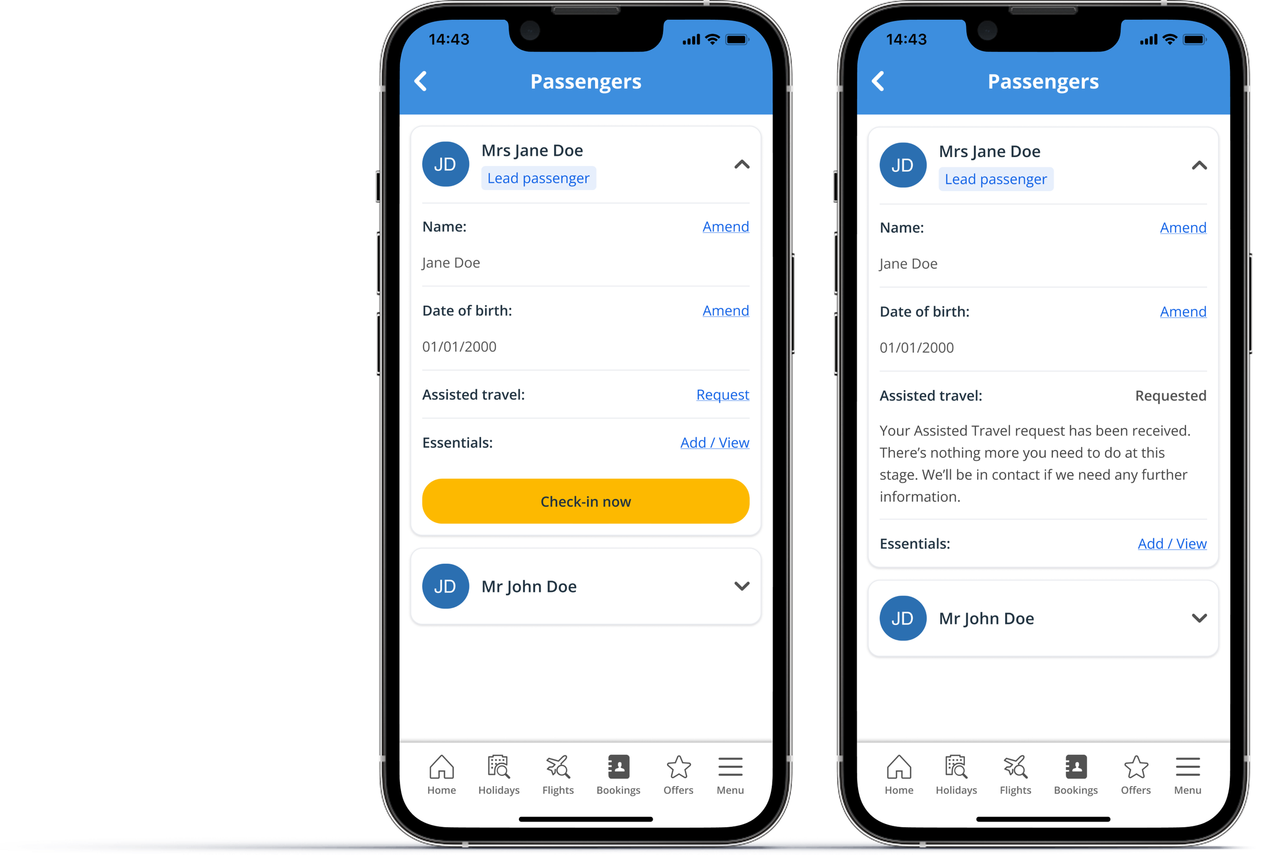
Creating a passenger-focused page to review and update details like assisted travel